Erreplus
New Catalogue System
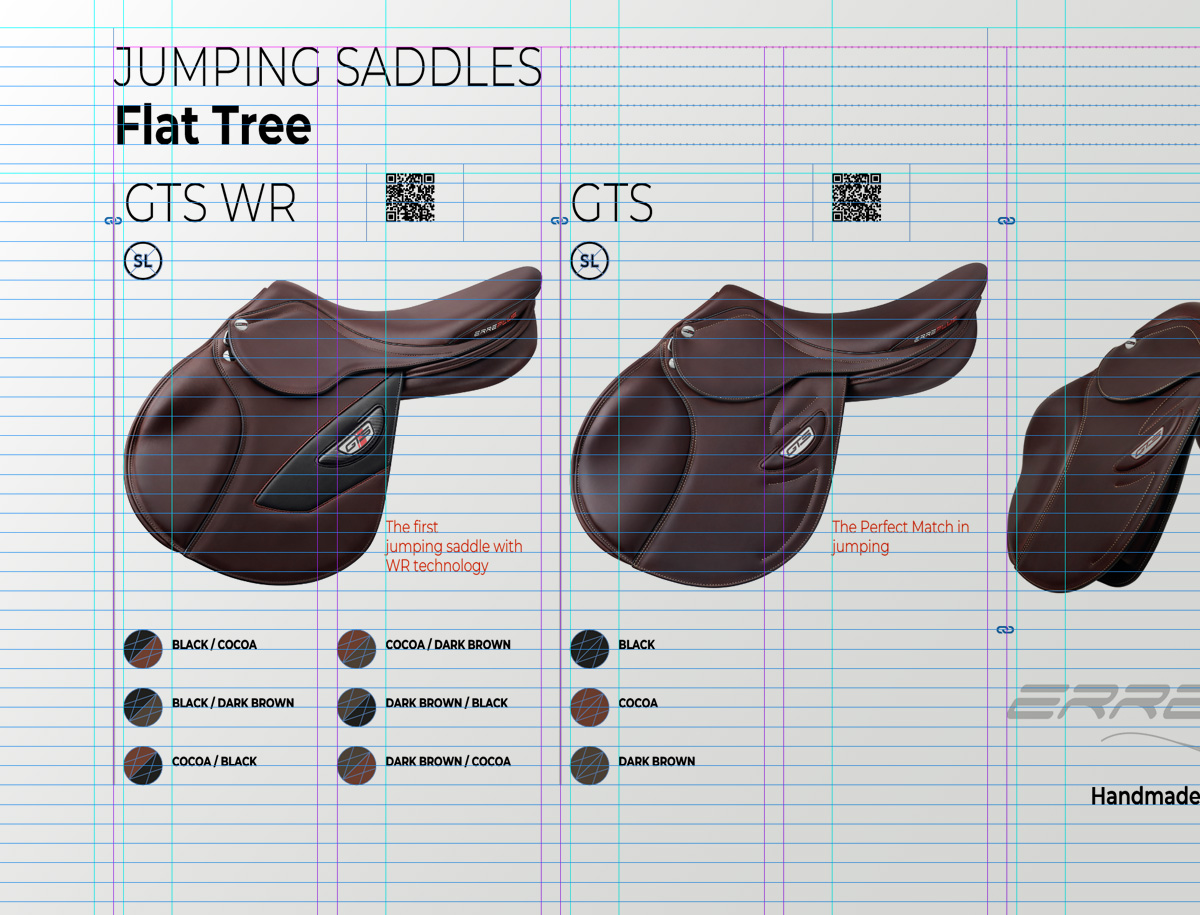
A conceptual restyling, rather than a purely aesthetic one — the visual language remains consistent with the brand’s identity. We have redefined the way the entire catalogue is presented: a new graphic layout, a new binding, a new grid system, and a new typeface. Only the closed format has remained unchanged.
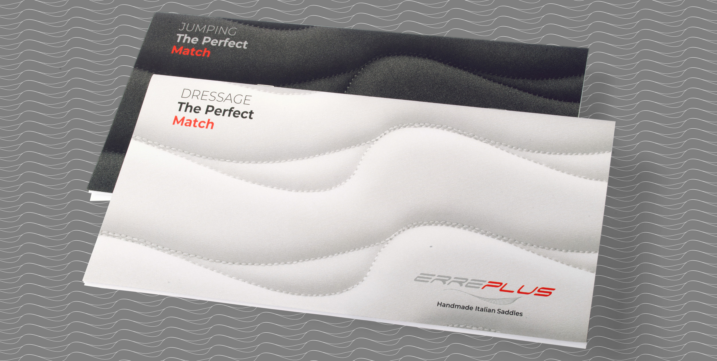
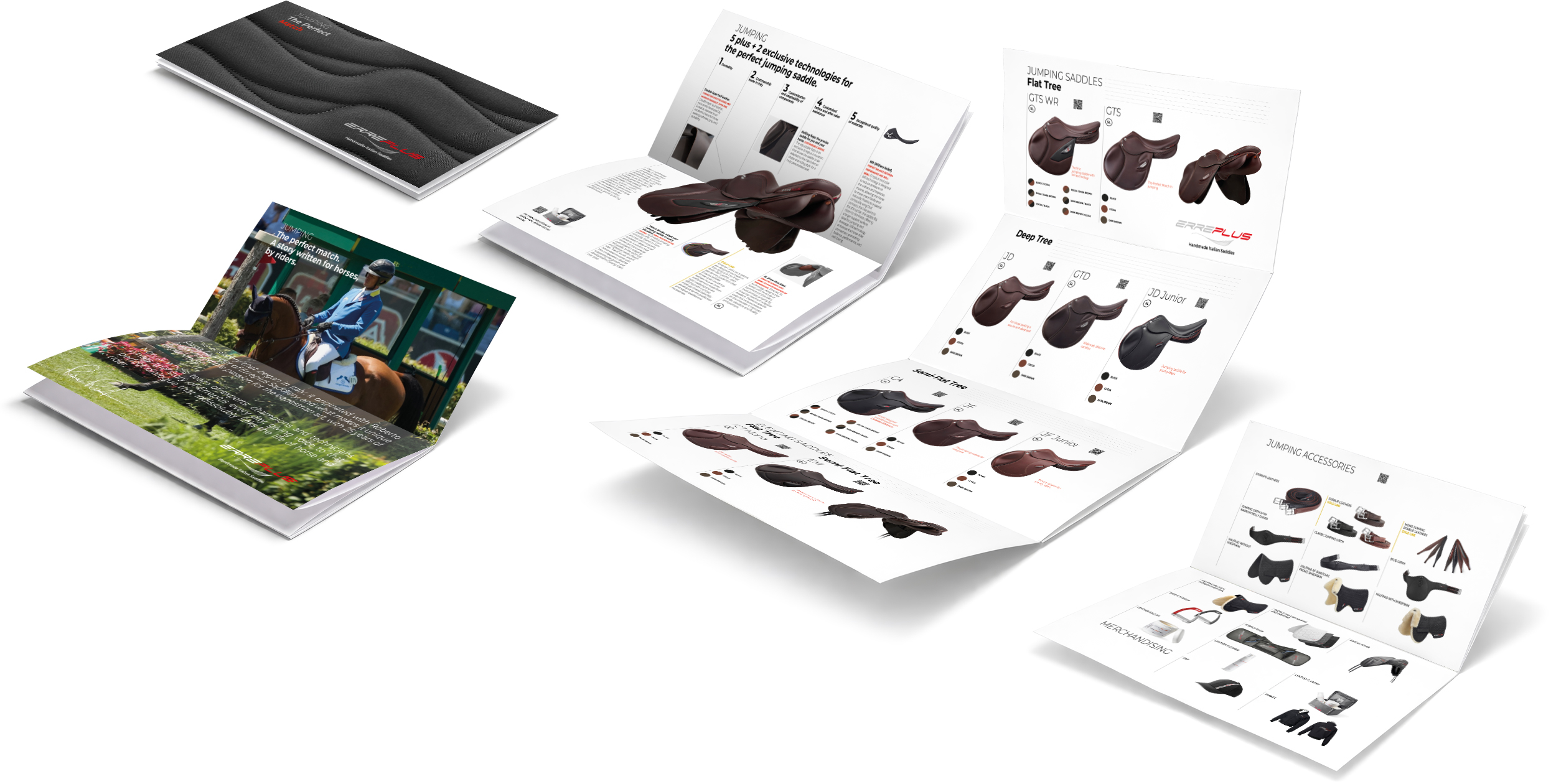
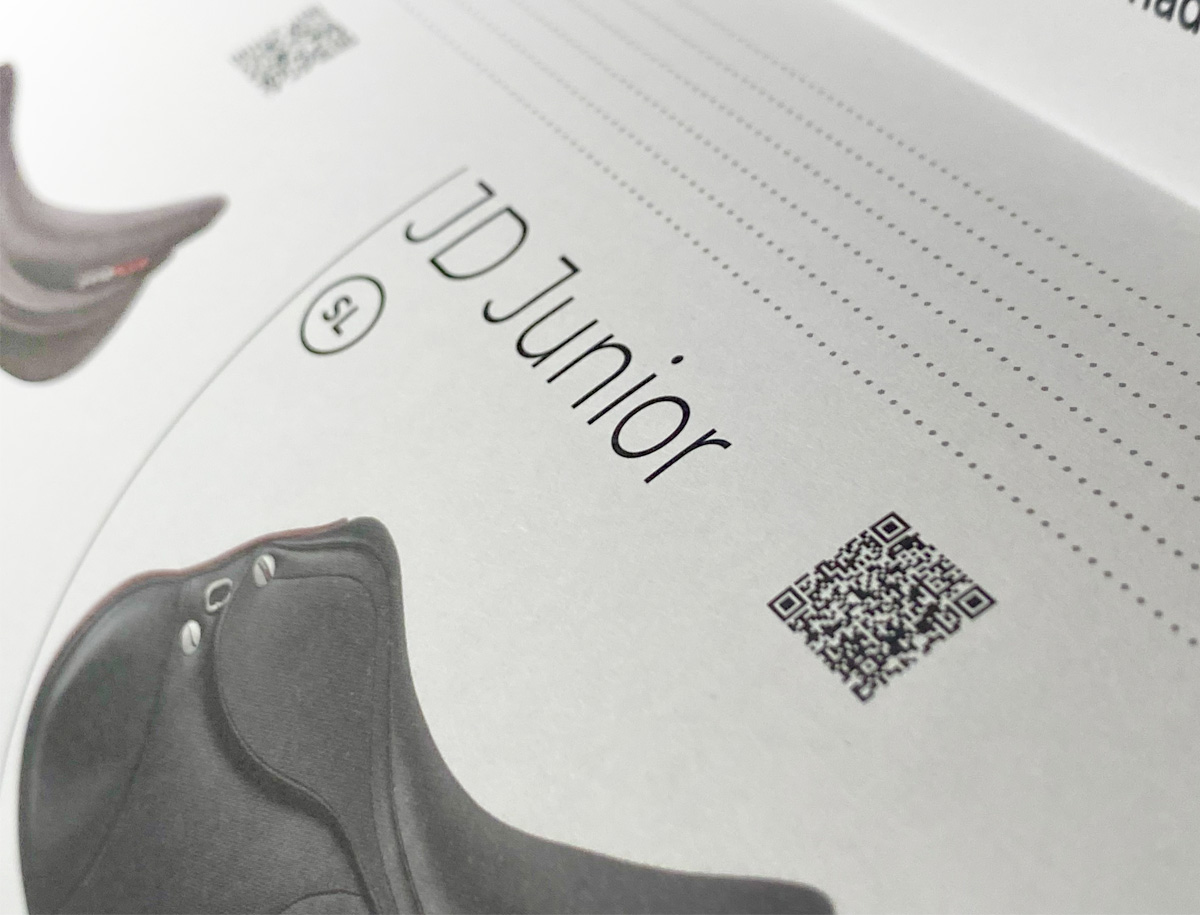
The two catalogues are distinguished by their covers, featuring photographs of the saddle pad in black for Jumping and white for Dressage. The saddle pad’s distinctive stitching pattern, originally designed by Erreplus, becomes a graphic texture that echoes the brand’s symbol, extending the visual language across different applications. The key features of each product line are brought together on a single double-page spread, allowing readers to immediately understand what sets each line apart while providing sales teams with an effective presentation tool. The complete product range is presented in a central four-panel foldout, with additional technical specifications for each saddle accessible on the website via QR codes. A dedicated double-page spread at the end of each catalogue now showcases the corresponding product line’s accessories and merchandising.